Since the different digital mediums we use - such as camera sensors, types of display panels and print technologies - have very different limitations in what colours they can measure/reproduce, we need some kind of common ground – a way of telling each device how the colours are supposed to look. If I have a colour described as 253,2,10 (which is level 253 for Red, 2 for Green and so on…), then we need to know what level 253 should look like according to the original source. Fx: Let’s say you’re retouching an image on an old display that has a limited colour gamut (range). The red letterbox in the image should look just right, but since it’s at the limits of the screens capabilities, the “just right” is obtained by you saturating the red colour almost all out, which translates to level 253 of 255 for red in a JPG. Now your friend sees the image on his modern wide gamut display, which can show far more colours because it can saturate the primary colours much more than your old display. The file says the red should be at level 253, which on his screen is a “Hollywood theatre blood in full blockbuster movie mode” saturated red – nowhere NEAR the Red you saw on your screen.
This is where colour spaces come in handy. A colour space defines what “Full” or fully saturated Red, Green or Blue means in old school wavelength measurements. By limiting how much saturation each primary colour can reach (effectively creating a limited colour space), and if devices adhere to this limit, we all understand how a saturated level 253 Red actually should look. This colour space information should be embedded in each image file, so we know how to interpret the levels correctly – otherwise its Hollywood vs. The Danish postal service as above.
There are lots of possible limited colour spaces, but luckily most displays in the early ages of computers had more or less the same gamut. So effectively a colour space describing this gamut became a “de facto” standard for computer displays. This Color space is known as sRGB, and it is a fairly limited amount of all the colours humans can see. Offset equipment, and later on printers, could however easily print colours, that these basic displays could not show. So a different - wider - colour space was needed to be able to describe this. Adobe Software among others created colour spaces for this, but the Adobe space - known as aRGB - ended up being the most well known and broadly used standard.

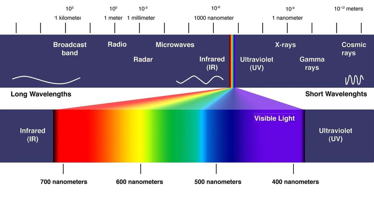 The Electromagnetic spectrum and specifically the visible light wavelengths.
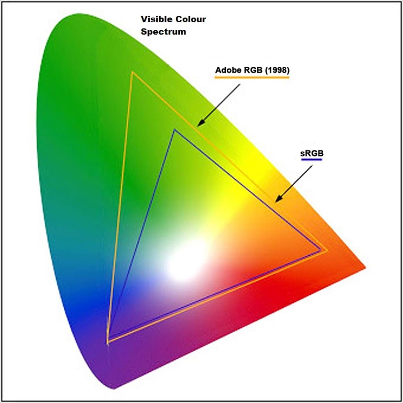 Visualisation of how the visible colour spectrum compares to the limited sRGB and wider aRGB colour spaces.